
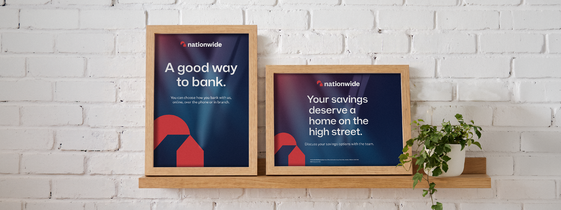
Nationwide Display
Typography | Accessibility
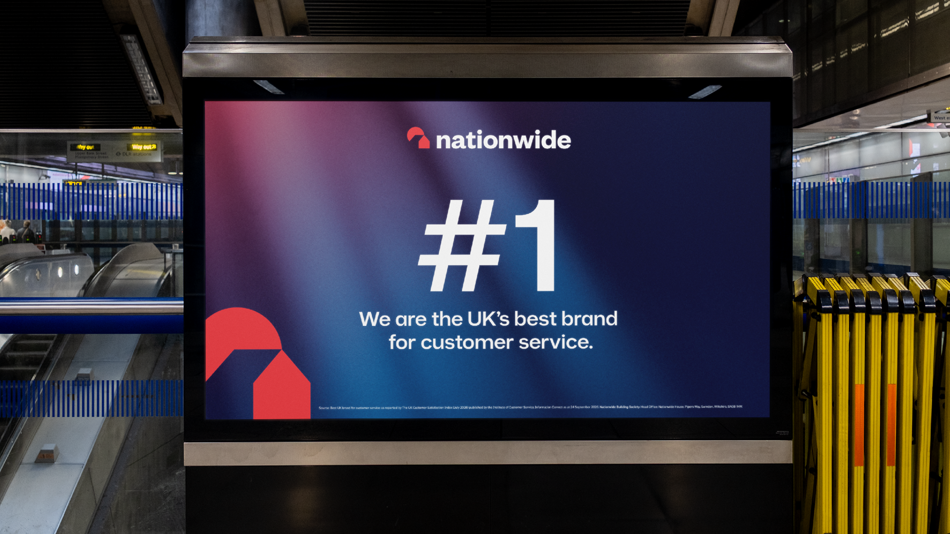
To ensure their communications felt modern and distinct within a competitive financial sector, Nationwide Building Society looked to evolve their headline font. Using an existing font as a robust foundation, the approach centred on crafting an accessible font designed to remove visual and neuro-processing barriers.
The development process placed accessibility at the absolute forefront. We made specific adjustments to individual letterforms, alongside broader holistic refinements, to maximise clarity and reduce visual stress across all touchpoints. To validate these key accessibility improvements, the font was reviewed internally with identified dyslexic users.
The result is a clean, modern and inclusive typeface. Ensuring Nationwide's communications are effortlessly readable while maintaining a distinct, contemporary edge.
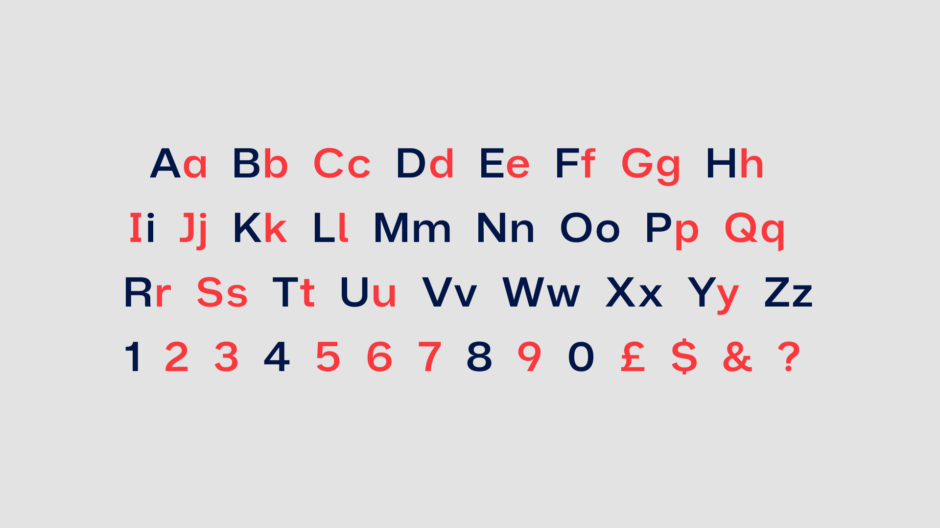
Disambiguation
Similar or even identical characters were redrawn so they can be easily identified against one another.
Disambiguation
Similarly shaped characters, or ones rotated from others have been redrawn to reduce miss-identification.
Disambiguation
Tails emphasised to help distinguish shape from similar characters, especially for mirrored or rotated characters (e.g. b/d/p/q).
Apertures
Opening up the spacing between strokes and terminals help to clearly identify characters verses others that are similar in shape.
Descenders
Descending strokes that go below the based line increased to aid in identification when used at smaller font sizes.
Contextual Alternatives
Adjusted letter shapes depending on the proceeding characters help to reduce white space and increase overall legibility.
Letter Spacing
Increased metrics between every character helps to make each letter is more easily identifiable against each other.
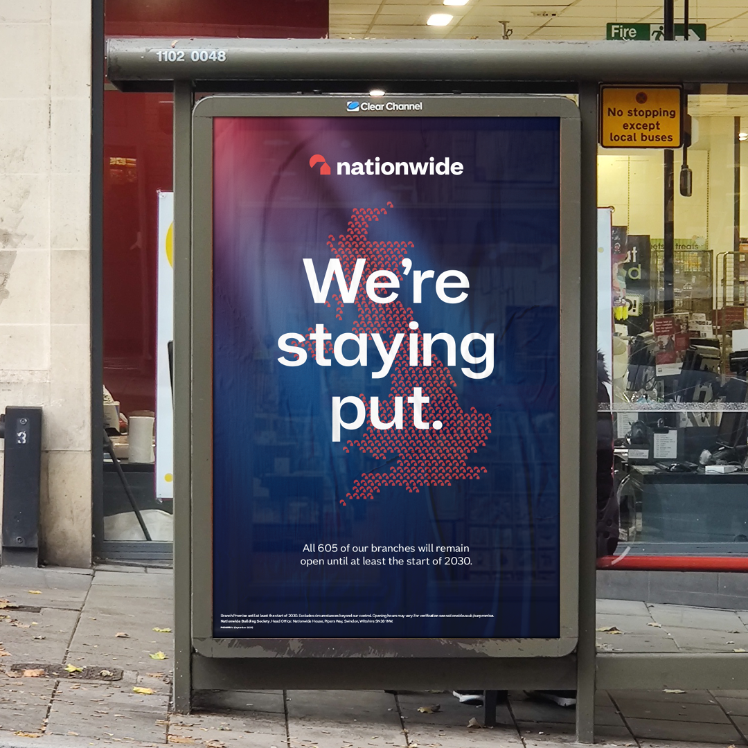
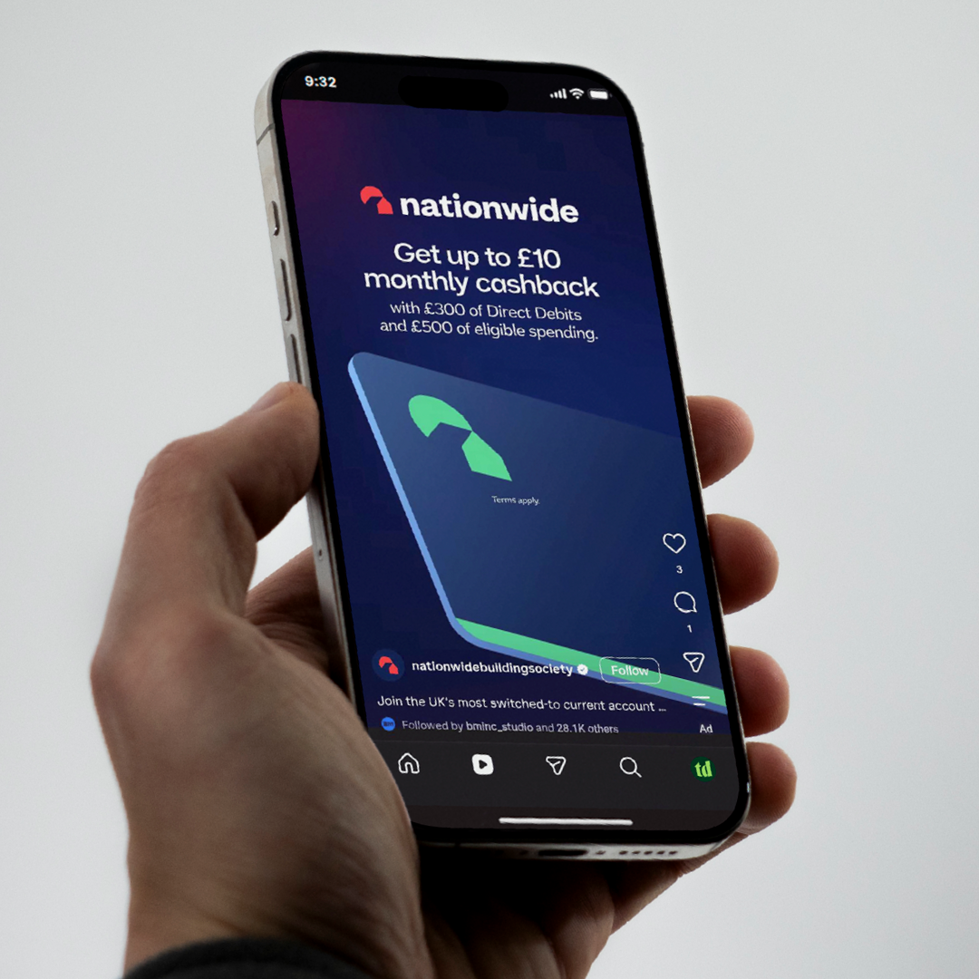


All in application designs © Nationwide.
Keep exploring…


<! data-preserve-html-node="true"-- 06.26c01v3 Summary Block Portfolio -->