
An Inconvenient Graph (or 5)
The human impact on our climate is an undeniable fact.
You only have to step out of your front door lately to realise that it's definitely getting hotter and hotter year on year.
The immediate effects of scorching weather are plentiful: many European nations have shattered record high temperatures; festivals and parades have been cancelled entirely; and excess deaths across both France and Poland have exceeded 1,000 in recent heatwaves.
The concerning fact is that this has not come out of the blue. Climate scientist from across the globe have been warning us for decades. They've employed scary possible scenarios, predictions for ever-rising temperatures and, my personal favourite, data visualisation in the form of charts, graphs, and diagrams.
Why it all matters
Because while a spreadsheet of global temperature anomalies can make your eyes glaze over, a well-crafted visual helps align understanding. It transforms abstract, overwhelming scientific metrics into a tangible narrative – turning a passive observer into someone who may just suddenly understand the gravity of the situation.
However, there’s a wrong and right way to do it. Just presenting a prettily presented graph and hoping that will be enough, sadly won't be, effective data visualisation needs to be designed, and relies on a strict set of communication principles:
Do not mislead: Everything is truthful. There are no chopped axes, no cherry-picked timelines or any distorted scales. Truth builds trust, and trust is the only currency that matters in any science communication.
Show the trend: They answer the vital question: Compared to what? By establishing the status quo and showing where the story was going before that key causation, the sudden departure from the norm becomes unmistakable.
Emphasise the point: They make sure it is crystal clear why this graph is being shown. They don't just dump data on the screen and hope you figure it out; they guide the eye directly to the core insight.
With that in mind, here is a rundown of my top 5 data visualisations specifically about rising global temperatures, CO2 emissions, or how mankind has unmistakably played its part that tick all three of the above boxes.
Climate Stripes
First off, and trying not to show any bias as an alum, is the University of Reading ‘Climate Stripes’ designed by climate scientist Prof Ed Hawkins.
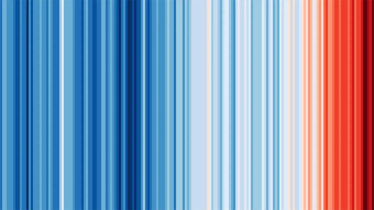
© Prof Ed Hawkins / The University of Reading
Beautifully simple, this ever-growing ribbon of blue-to-red stripes represents the global average temperature for each year dating back to the early 1800s. No words, no numbers, just lines of colour. It is a masterclass in minimalism, there is no visual noise that detracts - it shows the trend but also effectively emphasises the point.
This motif has been widely accepted as a ‘brand mark’ for climate action, having been adopted by news organisations, football clubs, Formula E teams, and even projected onto the White Cliffs of Dover.
Climate Pulse
The next is by far the most straight-laced, but coming from the EU’s Copernicus project, you wouldn't expect anything less.

© European Centre for Medium-Range Weather Forecasts
Updated daily, this line graph accurately shows daily average global temperatures spanning across the year – they call it the Climate Pulse. By default, it highlights the three most recent years against the mass of data dating back to 1940, alongside the average for the decade pre-millennium.
The simplicity but overall accuracy of this graphic is likely the reason why it is one of the most popular choices for news outlets to roll out when writing articles on climate change. It very clearly points out the status quo amongst the thousands of data points and most importantly, draws the reader to key issues at hand.
Data Art
Often, the barrier of being too technical or abstracted can get in the way of the point of a piece of data visualisation. Illustrator and science communicator Jill Pelto beautifully solves this problem.
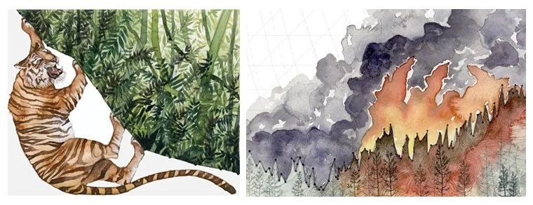
© Jill Pelto
Featured in academic journals, exhibition spaces, and even on the cover of Time Magazine, Jill's pieces help contextualise the data without having to spell it out for the viewer. Whether that's for carbon emissions, deforestation, or fish stocks.
By weaving actual data lines into watercolour landscapes - like the jagged line of a melting glacier or the rising curve of sea levels forming the crest of an ocean wave - Jill breaks down the barrier between statistics and visceral reality – really driving the point home. She reminds us that data isn't just an abstract metric; it's an ecosystem under threat.
What’s Really Warming the World?
Fourth is Bloomberg’s interactive masterpiece: "What’s Really Warming the World?". This is a masterclass in data storytelling.
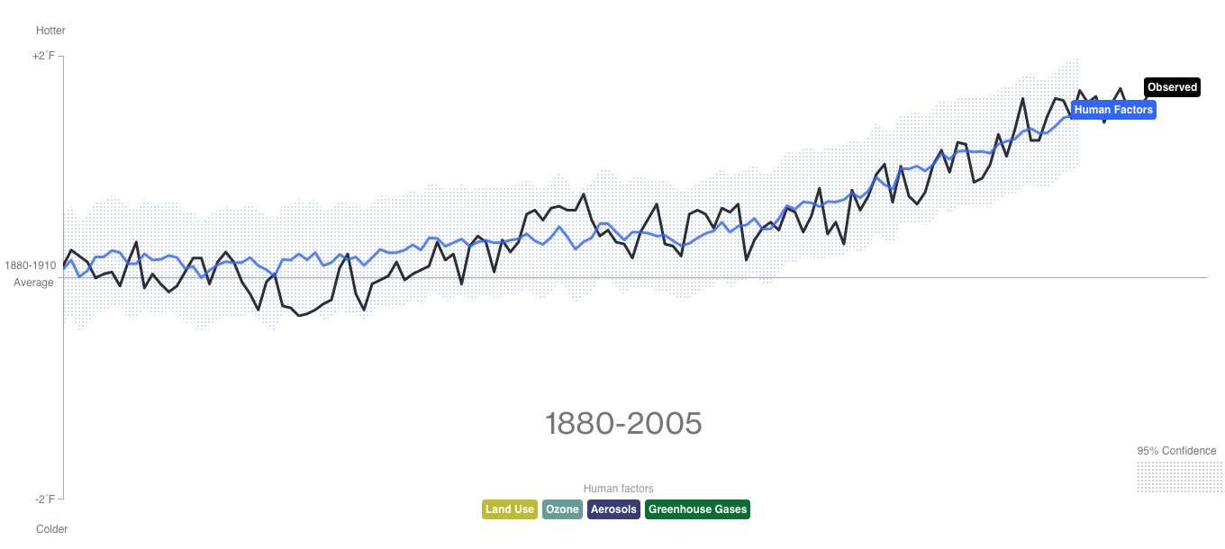
© Bloomberg
The graphic starts with the observed temperature rise and then systematically plots the data for potential natural culprits: solar activity, volcanic activity, and orbital shifts. One by one, these natural factors flatline against the actual temperature curve.
It’s only when the user scrolls down to layer on human-led greenhouse gases that the lines match perfectly. It’s a visual debunking machine that uses clean, interactive design to separate mere correlation from undeniable scientific causation.
A Timeline of Earth’s Average Temperature
Lastly – and I've pulled this one out on climate change deniers before – is XKCD’s (Randall Munroe) "A Timeline of Earth’s Average Temperature."
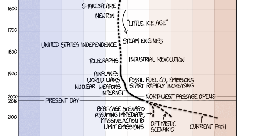
© XKCD’s / Randall Munroe
Although far too large to show properly in this format, its effectiveness comes from its sheer scale. Starting back 22,000 years ago – towards the end of the last ice age – it tracks global temperature differences of +/- 5 degrees. There’s no contracting of time periods, no logarithmic scales to confuse the reader, it shows the data as the data is – in context.
By using physical scrolling distance as a proxy for time, Munroe forces the reader to physically experience the scale of time where not much actually happens.
The ‘punchline’ comes when, after 14,000 pixels of scrolling, you finally reach the 20th century, where the graph takes a massive, sudden dogleg straight towards the global peril. Although delivered with the usual intelligent sense of humor XKCD is known for, it presents the facts on a timeline scale that you can finally comprehend and compare against.
Final Thoughts
Data visualisation isn’t just about making your numbers look pretty; in the larger context of climate change – and indeed, any complex industry – it is a tool for survival, alignment and in my experience, even funding.
As communicators, designers, and leaders, our job isn't to overcomplicate the science to look smart, but to make it accessible to ensure we are effective. The data is already blatantly obvious; a great visual simply brings it into focus for those who don't have the time or expertise to review your spreadsheets. If you want people to act on your data, you first have to make them see it and understand it.