
Wayfinding as Placemaking
Why civic pride starts down your street
Placemaking aims to give a community a tangible sense of belonging and ownership over the built environment. In modern urban planning, this usually manifests as high-profile interventions: an interactive 3D map outside a central train station, a revitalised children’s play area, or a community park planted with native flora.
While these capital-heavy projects create meaningful, tactile connections, they share a major blind spot: they centralise placemaking to a handful of council-approved destinations. The moment you turn down an ordinary residential street, that intentionality vanishes.
When I get the opportunity to travel – being the unapologetic type nerd that I am - the first thing I tend to look at is a city’s street nameplates. They are purely functional municipal infrastructure designed to stop people from getting lost. In the UK especially, standard procurement means they are usually humdrum, uninspired, and engineered down to the lowest bid: pressed aluminium, often a generic font, and zero local soul.
But there are those that stand out – not in the just visual sense – those that have taken the time to reference the local vernacular. By selecting specific materials, locally inspired typography, and historically relevant aesthetic choices, a street sign stops being mere navigation. It becomes an everyday assertion of what it means to be a local.
Here are three cities that understand how everyday wayfinding builds a sense of place:
Málaga
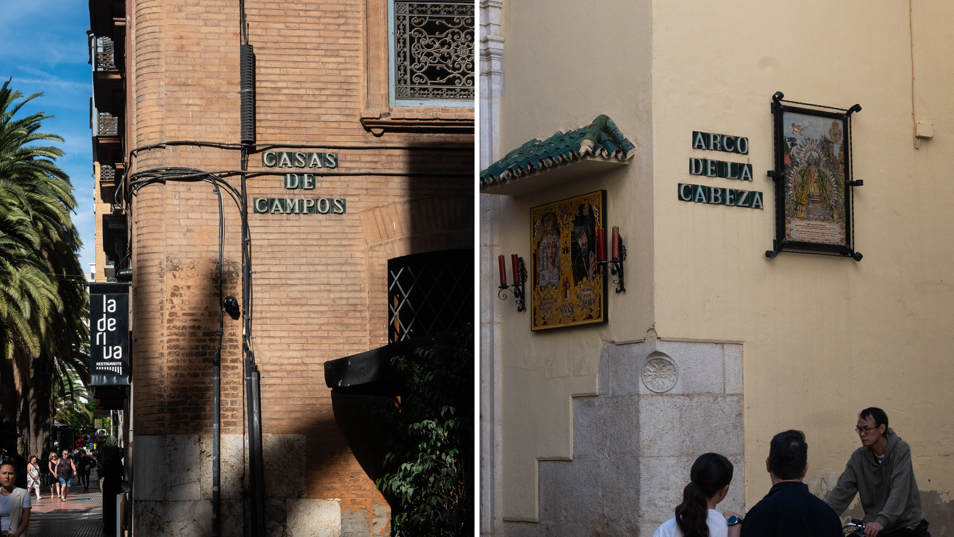
In the early 20th century, Málaga set out to standardise its street navigation. Rather than adopting the utilitarian metal signage becoming common across Europe, the city commissioned a system rooted entirely in the regional vernacular.
The signs are rendered in traditional glazed ceramic tiles, tapping into Andalusian Moorish craft traditions that persisted long after the Reconquista. The material choice was practical: ceramic resists the corrosive, salt-laden coastal air that degrades untreated metals and timber. Comparatively to enamel or even contemporary sign material, Malaga’s ceramic signs often last well over 70 years.
Visually, the stark white text and rich green base – the colours of Andalusia – provide crisp legibility while sitting comfortably against the city’s warm limestone and brick façades. Finished with distinct lettering evocative of early 20th-century artisan sign-writing, these protected cultural assets stand as a lasting triumph of Spain’s Regionalismo movement - a deliberate push to resist creeping international aesthetic by cementing (or grouting) local craft directly into the community’s fabric.
Birmingham
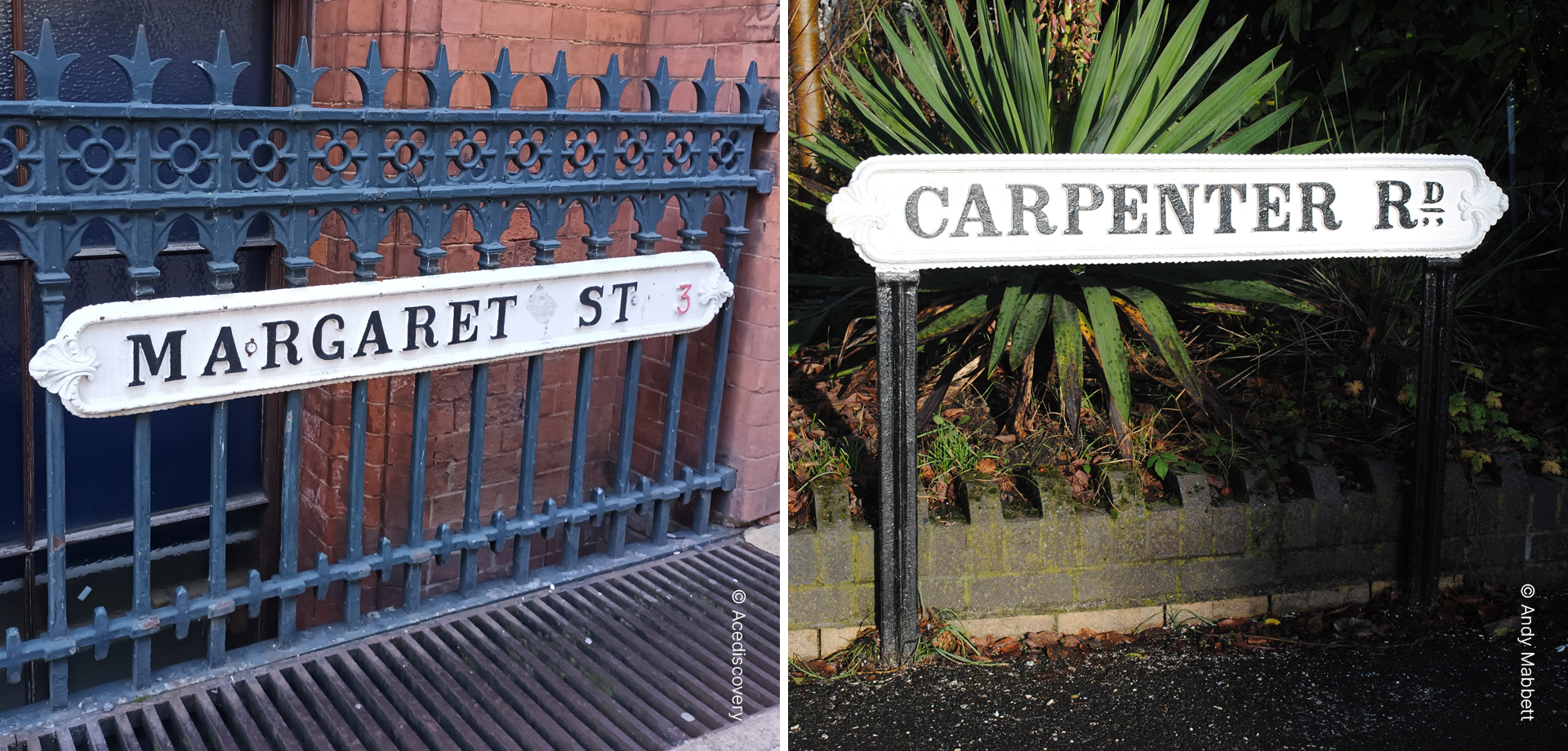
Closer to home, Birmingham’s historic cast-iron street nameplates, first introduced in the late 19th and early 20th centuries, tick every conceivable box for vernacular wayfinding.
Their solid cast-iron construction directly reflects the West Midlands' industrial supremacy in smelting, foundries, and heavy manufacturing. Look closer at the details: the delicate trefoil border nods toward Birmingham's historic Jewellery Quarter and its reputation as a city of a thousand fine trades. To crown it all, the typography is set in Baskerville – a typeface created by John Baskerville right here in the city in the 1750s. Every street plate is a compact monument to Birmingham’s industrial, artisanal, and typographic heritage.
This distinctiveness is where placemaking quietly succeeds. While decades of council procurement have filled the UK’s street with the same uninspired style of sign, Birmingham’s cast-iron signs are unmistakable. Genuine civic ownership demands this visual specificity; it is impossible to feel pride in street furniture that could belong anywhere else.
Venice
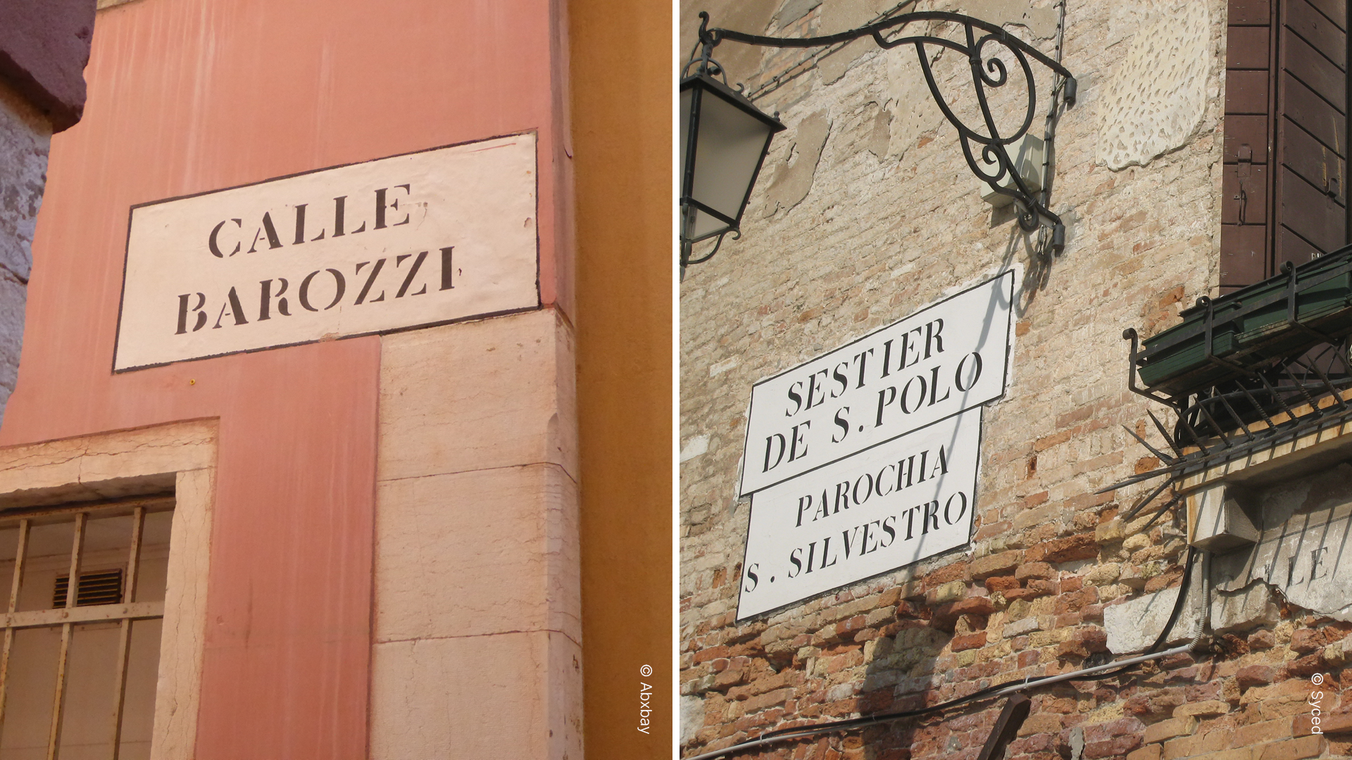
Venice solved the challenge of municipal standardisation by avoiding physical signs altogether. Instead, it relies on "little bedsheets", or nizioleti in native Venetian – white plaster rectangles painted directly onto building façades, framed in black, and lettered using stencils.
This technique is intimately suited to a city built on shifting timber piles and waterlogged masonry, where heavy metal brackets would accelerate structural decay or rust into the lagoon. Stencils allowed quick, precise application even while painters worked from bobbing gondolas and boats.
Crucially, the nizioleti protect intangible heritage: they are written almost exclusively in the Venetian dialect rather than standard Italian. They preserve historic nomenclature unique to the city’s geography; such as fondamenta (a street running alongside a canal), or rio terà (a filled-in canal). The wayfinding doesn't just guide your feet; it retells the story of how the city was built.
Pride in the Everyday
Pride in where you live is rarely built in a distant, flagship city square that you may resident visits once a month. It begins the moment you walks out of your front door and look at the corner of your road.
When street furniture reflects local culture, geography, and memory, it weaves ordinary residential streets into a shared civic story. Wayfinding shouldn’t just tell you where they are going – it should remind you why you belong.